 NY Times Mini
 NY Times Crossword
 NY Times Midi
 NY Times Wordle
 NY Times Connections
 NY Times Connections Sports Edition
 NY Times Strands
 NY Times Spelling Bee
 NY Times Pips
 Word Salad
 Contexto
 Blossom
 Betweenle
 Conexo
 Bracket City
 Fluxis
 Stacks
 Atlantic Crossword
 LA Times Mini
 LA Times Crossword
 Word Hurdle
 Crosswordle
 NYT Crossplay Solver
 Anagram Solver
 Scrabble Word Finder
 Words With Friends Word Finder
 Atlantic Games
 LA Times
 Zorzzle
 Word of Fortune
In the bustling world of media, one name stands out with a distinguished air of tradition: The New York Times. Affectionately dubbed The Gray Lady, this venerable institution has long been synonymous with quality journalism and high editorial standards. But guess what? The Gray Lady ain't so gray anymore! She's gone from vapid (the Wordle word of the day when I started writing this article) to today's colorful and fun, via cold type (1978) and digital. Let's dive in and see how The New York Times went from grayscale to technicolor!
From Monochrome to Multimedia: Shades of Change in NYT's Design
1960 - 1980 Louis Silverstein's Key Moments
Between 1960 and 1980, Louis Silverstein, an innovative art director for The New York Times, transformed the newspaper's design from a dense, text-heavy publication into a more visually engaging medium.
- 1967
As the corporate art director, Silverstein changed the body typeface from Ideal to Imperial and increased the size of the text. He also introduced more white space, enlarged photos, and transitioned from eight-column to six-column pages, making the paper more accessible and reader-friendly.
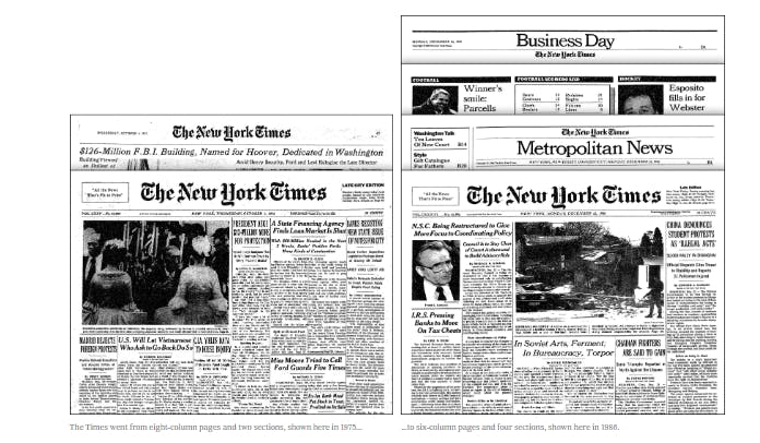
Image source: NYT - How The Lady Became Less Gray
- 1969
The New York Times Company went public amidst the rise of TV and media, marking the beginning of the short attention span era and also purchasing television stations, magazines, and newspapers. They introduced sections like SportsMonday, ScienceTimes, and the Weekend Arts, reflecting a shift towards lifestyle magazine influences, which sometimes raised concerns about harming the reputation of the Gray Lady.
- 1978 - The change of the century: switching from hot type to cold type.
This transition, led by Silverstein, meant moving from hand-placed text line by line to laser and photocomposition, allowing for a wide range of infographics (Silverstein called them "sides of beef") and visual elements like diagrams and timelines.
Today, The Times continues to apply some of Silverstein's design principles, carefully maintaining the look of the Gray Lady while upholding its sense of responsibility and focus on objective, factual news.
Introducing Color at The New York Times (after 1990)
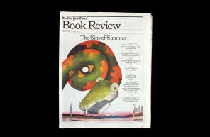
In the early 1990s, The New York Times considered printing in color, a controversial move for the "Gray Lady." Initially, Steven Heller, the former art director of The New York Times Book Review, was skeptical about abandoning the traditional black-and-white format. Ironically, it was the Book Review under Heller’s leadership that first experimented with color in 1993, featuring a vibrant illustration of a serpent on its cover.
Following this initial foray, other sections like Travel, Arts and Leisure, and Real Estate embraced color, enhancing their visual appeal. However, the A section, which contained daily news, remained resistant to change. It wasn’t until October 16, 1997, that the first color images appeared on the front page of The Times, marking a significant milestone.
In a 2018 article, Tom Bodkin, the newspaper’s chief creative director who led the transition, explained the delay in adopting color due to two main reasons:
Technical Limitations
- The existing printing press couldn't support color printing, necessitating new infrastructure.
- Consistent quality in color printing was challenging with the technology available at the time, and The Times prioritized maintaining high standards.
Despite advancements, The Times still faces limitations in printing every page in color due to the varying capacities of the leased presses nationwide. This inconsistency can be frustrating, but the editorial team prioritizes impactful and engaging visuals, often waiting for a color page to publish significant images.
Reputation Concerns
There was a cultural belief that grayscale signified seriousness and credibility, while color was associated with less reputable tabloids. Management worried that using color could distort the news value or create the wrong emphasis on the front page.
Today, The Times embraces a “digital first” strategy, offering a richer selection of media for online editions. However, the decision to use color remains thoughtful and deliberate, ensuring that it enhances the storytelling without compromising the paper’s integrity.
From Anti-Fun to Puzzle Power: Decades of Change
The Dawn of Crosswords: A Wartime Shift
For decades, The New York Times was adamantly against incorporating games, proudly advertising in 1925 that it was “Without Comics. Without Puzzles.”
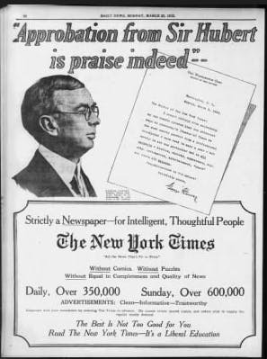
Image Source: newspapers.com
However, World War II prompted a change in attitude. Eleven days after the attack on Pearl Harbor, Lester Markel, the Sunday sections editor, suggested to publisher Arthur Hays Sulzberger that the paper include a crossword puzzle to provide readers with a distraction during wartime.
On February 15, 1942, the first crossword puzzle appeared in the Sunday Magazine, created by Charles Erlenkotter on a 23-by-23 grid and edited by Margaret Farrar. Reflecting the era’s harrowing realities, it included wartime clues like
- “Famous one-eyed general” (Wavell)
- “Nazi submarine base in Belgium” (Ostend)
The introduction of the crossword marked a significant shift in The Times' approach, adding an element of engagement and entertainment that was only the initial spark.
From Crosswords to Gaming Glory: A Puzzle-packed Journey
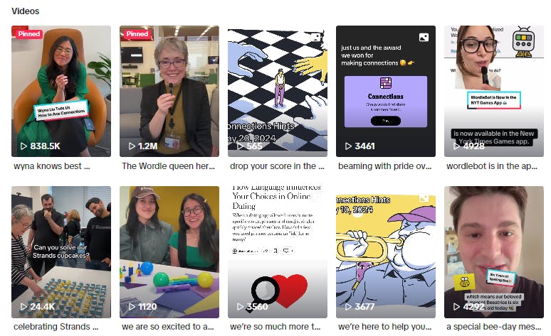
We've already covered what's next in From Crosswords to Connections: Exploring Trends in New York Times Games. Shortly, in 1993, Will Shortz became the crossword editor, modernizing the puzzles and boosting their mainstream appeal with the 2006 documentary 'Wordplay.' The launch of the Crossword app in 2014 and the daily Mini puzzle further increased their popularity. By 2016, the Games team expanded, and Games subscriptions surged. Ironically, the Covid moment became another crucial yet gray period. This time, Spelling Bee led the growth and was integrated into the Crossword app. In 2022, NYT acquired Wordle, another puzzle gem born out of the Covid crisis, driven by its viral success. In 2023, following Wordle's success, NYT introduced Connections, a word-association game that became a TikTok hit, pushing the Gray Lady to expand her social reach and welcome new audiences on new media channels where color is a must. Today, people spend more time on the NYT Games App than on the News one.
Looking Forward: The Colorful Future
As media marches onward into the digital age, one can't help but ponder the path ahead. Will technology continue to reshape our news consumption habits? And how will The Gray Lady navigate these evolving landscapes?
In the years to come, we foresee a harmonious fusion of color and technology woven into the fabric of journalism. Whether through immersive graphics, virtual reality experiences, or groundbreaking gaming platforms, The New York Times must strike a delicate balance. It must captivate and engage audiences while upholding its steadfast commitment to delivering journalism of the highest caliber.
As The Gray Lady embraces technicolor and gaming glory, the future holds endless possibilities. Stay tuned for the colorful adventures ahead!